I'd like to introduce you to my new friend, Tableau. Why am I talking about Tableau and not the EAC and IHRSM projects? Its quite simple, as of today, there is nothing new to publicly update about our ECA and IHRSM implementation projects although there is some background action. It is really exciting to see these project moving ahead as they will be taking our institution to a new level and the improvements to the employee experience should be tremendous and the experience for the people who work in HR and Payroll should be greatly improved, too.
My new friend Tableau... a little background information.
Our institution has been trying to move to a more data-centric organization. Every department works at it's own speed, given its own needs, talents, and abilities. The institution, as a whole, has seen enough value in being data-centric that we have invested in Tableau and a small team that really leads the charge to build dashboards for various departments. Better yet, they are empowering departments to build their own dashboards so when I learned about that, I jumped at the opportunity to take their Tableau training. Unfortunately, I couldn't develop the interest in my previous department to take on a dashboard project.
For the uninitiated, Tableau, according to their website, is
"a visual analytics platform transforming the way we use data to solve
problems—empowering people and organizations to make the most of their
data."[1]
I have always been fascinated with HR metrics and have pushed companies that I have worked for to pay more attention to what the HR numbers are saying. My typical experience is that any HR numbers that were published were to serve a financial or basic operational need, not to tell the story of what is happening with our workforce. When the opportunity came up I volunteered and, wow, have I learned a lot along the way.
Through a series of meetings, we decided what we wanted to display. Using Tableau wasn't off my radar, but I have done similar projects using Excel and they were typically for my own use to be able to talk about where we stand within our HR practice. As I have done a lot of this with Excel, it was a logical starting place for me.... big mistake. While I won't say that Excel can't handle large data sets, these are the largest data sets that I have ever worked with and Excel was sluggish, at best, to process them. Stripping down the data sets was eliminating information that I thought I might need as we refined our requirements. Given these struggles, I took in upon myself to start developing the dashboards in Tableau.
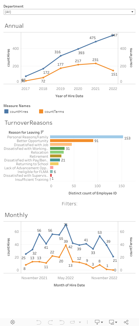
Greetings and Farewells
Our first dashboard is called "Greetings and Farewells" and presents a basic look at:
- Hires - last 13 months and last seven years
- Separations - last 13 months and last seven years
- Separation reasons for the last 13 months
This is all fairly straight forward information and
can easily be compiled by any organization to show if the recruiting function
is keeping up with people leaving the company... after all, nobody will be
staying infinitely.
As Tableau provides a reactive display, I encourage you to visit the original on the Tableau Public website to display the dashboard as I originally intended.
For this blog, I used a data set that I found on Kaggle.com as using my institution's data wouldn't be appropriate for this purpose.
How does this differ from the real data?
Given that I am using a different data set, there are some
differences in how I had to display this data. Primarily, this data is
static. It will not change. In real life, this data set will
continue to grow. I am lazy efficient and want to spend as little
time as possible maintaining reports. In both cases I set up a filter to
limit the display to the previous seven years and the last 13 months.
With live data, we needed to stop the year display at the end of the preceding
year for the annual chart and the preceding month for the monthly
display. This is established with a couple of calculated fields that were
applied to the filters.
On our institutional copy, we have additional filters. The departmental filter matters less and we are much more interested in the relation of this data to our executives, so our filters work up those hierarchies rather than a more traditional department relation.
Creating a data source
The Kaggle data set was also a little easier to use in that I didn't have to create it. Our HRIS is homegrown and the ability to identify hire and term dates is a little more complex, particularly as you consider the multi-employer, non-employees, students, etc... that exist in the live data. To create our Tableau data source I wrote a few queries in SQL, hitting multiple tables to capture the hire, separation, and promotion data, applying a category via a case statement for each type and a common set of attributes, and a union all between each query to create one final query to pull the data together.
Once the team was satisfied with the information, we created
materialized views that we could then link to Tableau as a data source.
Ultimately, we are adding several queries to this data source to represent the
employment life cycle, which I will discuss more in a future post.
No comments:
Post a Comment